mainnav_head
title_homepage
clippings
Tristan (Administrator)
Whitespace
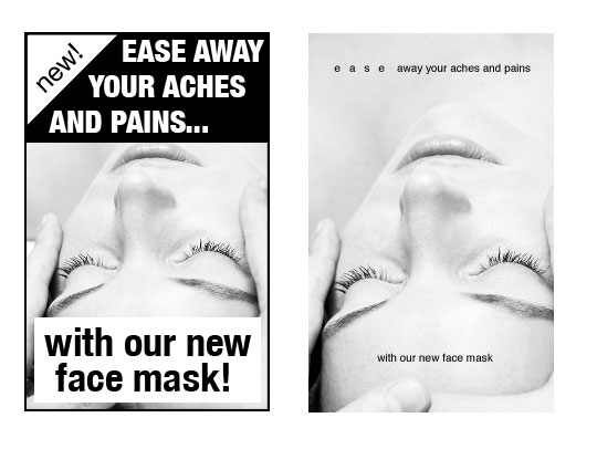
An excellent article on A List Apart on how to use whitespace properly
http://www.alistapart.com/articles/whitespace
ala1.jpg
Tristan (Administrator)
low contrast helpfull? thats new!
Funny you say that because we sometimes get complaints about imageafter lagging contrast and unreadable for some people with problems seeing. Perhaps our next design needs to just have a larger font insteas of just high contrast. Or atleast a choice in contrast/fontsize. Unfortunately it is almost impossible to incorporate in this design because we did not sufficiently planned for those features.

In any case good to know there are also people who are helped by low contrast!
Stefan (Administrator)
RE: Whitespace
I actually have hold a little studie in an institute for visually handycapped people here in the Netherlands.
They all liked high contrasts.
About 75% used black letters on a white background, 15% yellow on a black background and the remain percentage used white on a black background. Haven't seen anyone using low-contrasts, but then again, their vision was really bad.

-S-
Stefan (Administrator)
RE: Whitespace
@danikreg
I wish it was that simple; Image*After isn't just one stylesheet, there are quite a few. Furthermore there are images to be adjusted as well. I see what I can do though without doing too much damage...

Stefan
Stefan (Administrator)
RE: Whitespace
@danikreg
I've just edited the homepage; made the text a bit darker - and the blue a bit lighter, thus adding more contrast. Hope it helps a bit. The new design prolly will be more rigorous. Smile
When I find the time, I will try to tackle the other pages (including the forum).

Stefan
dreamstime.com
mainnav_head
Terms of Use. Contact us. Free images and Free textures AddThis Social Bookmark Button
Suggestions?